As an art director and designer, I have worked intimately with type for decades, specifying type, hand drawing letterforms, and modifying them for custom projects and logos.
It was exciting to receive my first Speedball book and pen set when I was about 13 years old, and I became very involved with calligraphy and drawing fanciful letters. Although I never got very good at calligraphy, I do have a great appreciation of those who have mastered it. However, I did find myself fascinated with type and obsessed with observing how it is used.
The shape, size, weight and placement of letterforms are all essential, providing subliminal clues to convey messages effectively.
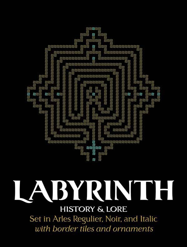
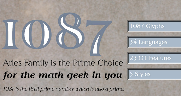
arles font family
Arles is named for the city in southern France where Van Gogh and Gauguin painted. They both exhibited styles that held to traditions while embracing the modern era of impressionism. The city itself, in its architecture and people exhibits an easy embrace of the modern world built upon a foundation of tradition.
Likewise the Arles family retains a serif with an appreciation of typesetting's roots. The large x-height, varied stroke thicknesses and use of fewer serifs is informed by a modern humanist approach, providing Arles with a character that is open and easily readable.
Each face in the family supports several Latin based languages and a number of OpenType features, making it a versatile choice for advertising design as well as publishing.


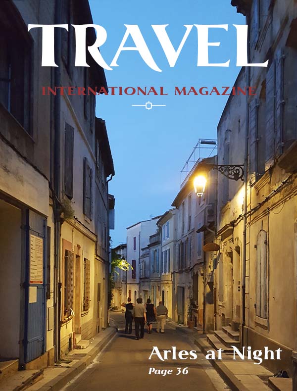

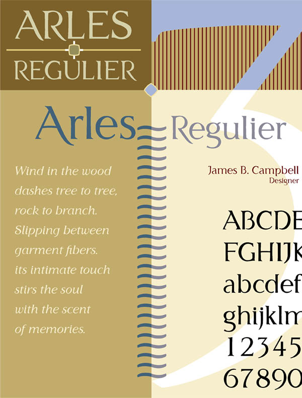
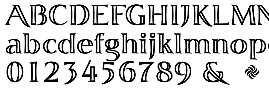
arles regulier

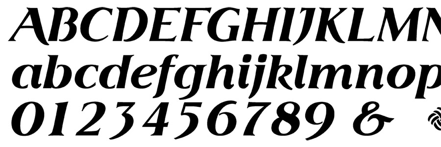
arles regulier italic

arles noir
arles noir italic
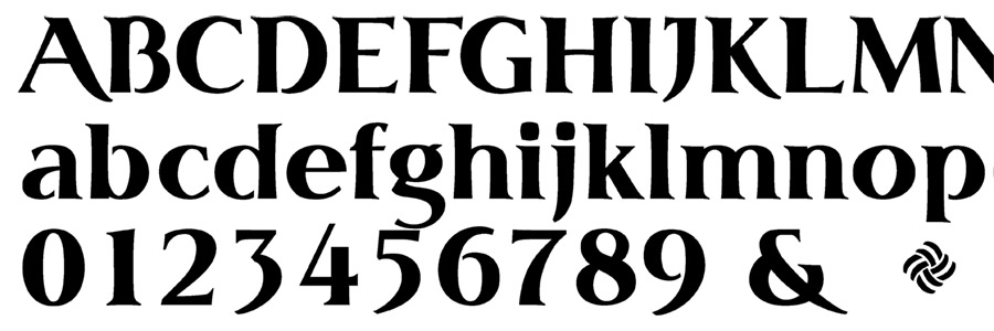
arles graver